In the world of design, color wields immense power. It goes beyond aesthetic appeal, playing a critical role in conveying a brand’s values, personality, and enhancing the overall user experience (UX) and usability. The journey to finding the perfect color palette for a product is intricate, involving in-depth analysis, experimentation, and often, a process of trial and error. This article aims to explore the strategic use of accent colors in design, emphasizing their role in optimizing user interaction and engagement with products.
Deciphering Color Schemes in UX Design
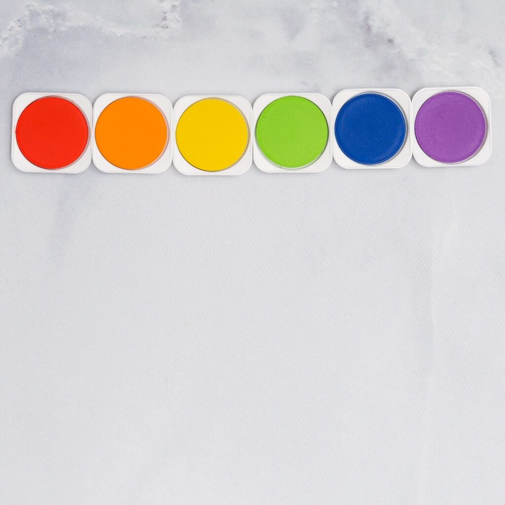
The foundation of color theory in design lies in Newton’s color wheel, a concept dating back to the 17th century. Modern designers still rely on this wheel to identify harmonious color combinations, utilizing geometric relationships within the wheel. The task might seem daunting, but it becomes manageable once the common color schemes are understood. These include:
- Monochromatic: Involving three shades, tints, or tones of a single color;
- Analogous: Combining three colors adjacent to each other on the wheel;
- Complementary: Using colors located directly opposite each other on the wheel;
- Split-Complementary (or Compound Harmony): A mix of analogous and complementary schemes, where the central color is opposite the other two on the wheel;
- Triadic: Incorporating three colors spaced equally around the wheel;
- Tetradic: Consisting of four colors, forming two complementary pairs.
After selecting the appropriate color combination for a product’s design, it’s crucial to organize these colors into primary, secondary, accent, neutral, and semantic categories, each playing a distinct role in the design.
The Role of Primary and Secondary Colors in Brand Identity
Primary colors in a product’s user interface (UI) are the most frequently used and are paramount in translating a brand’s identity and amplifying brand recognition. Brands typically incorporate one to five secondary colors. Although not imperative, limiting the number of secondary colors can enhance the brand’s palette recognition. It’s important to distinguish that in some contexts, “secondary” and “accent” colors are used interchangeably. However, a good rule of thumb is to view accent colors as part of the secondary color palette, but not vice versa.
Accent colors are meant to complement the primary color palette and are used less frequently. Their purpose is to make certain UI elements more visible and appealing, drawing the user’s attention to specific aspects of the UI. By being less predominant than primary or secondary colors, accent colors provide a strategic visual hierarchy, guiding the user’s attention where it’s most needed without overwhelming the overall design.
The Importance of Neutral and Semantic Colors
Neutral colors, ranging from black to white, are commonly used for text, whitespace, and background elements. They offer a visual balance and contrast, ensuring that the UI is readable and aesthetically harmonious. Semantic colors, meanwhile, are essential for user guidance throughout a UI. They convey specific meanings, allowing users to navigate the product intuitively. For instance, red is often used to indicate errors or warnings, while green might signify success or completion.
Implementing Color Psychology in UX Design
Understanding color psychology is pivotal in UX design. Different colors evoke different emotions and associations. For example, blue is often associated with trust and reliability, making it a popular choice for financial institutions. Green can signify growth and health, commonly used in environmental and wellness brands. Recognizing these psychological associations helps in selecting colors that align with the brand’s values and message.
Testing and Refining Color Choices
Once a color palette is chosen, it’s vital to test it in real-world applications. This involves assessing how the colors perform across various devices and in different lighting conditions. User feedback can be invaluable in this phase, providing insights into how the colors are perceived and interacted with. Refinement of the color palette may be necessary based on this feedback to ensure optimal usability and aesthetic appeal.
Balancing Aesthetics with Functionality
In the pursuit of a visually appealing design, it’s crucial not to lose sight of functionality. Colors should not only look good but also serve a purpose. This balance is especially important in creating accessible designs. For instance, sufficient contrast between text and background colors is essential for readability, especially for users with visual impairments.
The thoughtful selection and application of color in design, especially accent colors, play a crucial role in enhancing user experience and interaction. Understanding and applying various color schemes, alongside a knowledge of color psychology and user feedback, enables designers to create engaging, intuitive, and aesthetically pleasing interfaces. This harmonious blend of aesthetics and functionality not only strengthens a brand’s visual identity but also ensures a seamless and enjoyable user journey.
Understanding Accent Colors in UX Design
Accent colors in UX design serve a vital function, emphasizing various UI elements like buttons, progress bars, sliders, switchers, links, and headlines. These colors are often more saturated to make these elements stand out, thereby fostering user interaction. The inclusion of a secondary accent color can add diversity to the types of elements and information presented in the UI. However, designers must be cautious as an overabundance of accent colors can lead to a visually overwhelming user experience.
Implementing Accent Colors in UI Design
When a product’s color palette is defined, integrating these colors into a harmonious user interface is the next challenge. One popular guideline for achieving this harmony is the “60-30-10 rule.” This rule can be visualized as a suit ensemble: 60% being the primary color (pants and jacket), 30% the secondary color (shirt), and 10% the accent color (tie). This framework suggests a dominant use of the primary color, complemented by secondary colors, with accent colors used sparingly to add vibrancy and energy to the interface. This rule also provides flexibility, such as dividing the 30% allocation between two secondary colors for a balanced approach.
Best Practices and Cautions in Using Accent Colors
When employing accent colors, designers must ensure they do not create confusion or convey unintended messages. A typical error is using identical colors for both accent purposes and error notifications, potentially misleading the user. Furthermore, when using accent colors as backgrounds for text, it’s essential to ensure adequate contrast for readability, accommodating users with visual impairments. Tools are available to evaluate text and background contrast for accessibility purposes. Additionally, while color psychology is a potent tool in UI design, relying solely on color without accompanying text can hinder the usability for individuals with color blindness.
Systematically Building an Accent Colors Palette
Creating a well-balanced accent color palette can be guided by the 60-30-10 rule. After identifying the primary color, designers can refer to various color schemes to craft an accent color palette that complements it. In digital interfaces like websites and apps, accent colors are often selected from the brighter sections of the color wheel, especially for interactive elements like buttons.
Testing and Refining Accent Colors
After establishing a color palette, testing its application is critical. Tools like Palettte, Material, and Cloudflare enable designers to create mockups or prototypes to see how accent colors function in practice. Getting feedback from actual users is invaluable in this process. Various affordable user testing methods, like Guerrilla testing, can provide insights into how real people interact with the design. It’s crucial to remember that color choices significantly affect the usability of interactive elements, such as buttons, which may appear disabled if colored incorrectly.

Collaborating and Finalizing the Color Palette
Presenting the developed palettes and mockups to the design team and stakeholders is an essential step. Emphasis should be on the quality of the presentations rather than the quantity. Once the palette receives approval, tools like Coolors and Adobe Color can assist in organizing and exporting the palette, including hex codes for team use. Designers can also look to other brands’ color guidelines, like those from Atlassian, Mailchimp, and IBM, for inspiration.
Enhancing UX Design Skills with Color Palette Creation
The creation of a color palette is far from a random process; it involves considerable effort and creative thinking. A well-crafted palette communicates a product’s identity, appeals to users, and meets usability standards. This process highlights the importance of color in UX design, not just as a visual component, but as a critical tool for enhancing user experience and interaction.
The Impact of Accent Colors on User Perception and Behavior
Accent colors do more than just attract attention; they can significantly influence user perception and behavior. The right choice of accent color can guide users to take desired actions, such as clicking a button or noticing a critical piece of information. This psychological aspect of color use is a potent tool in the hands of a skilled designer. For instance, a bright accent color can create a sense of urgency or importance, while a softer hue might suggest calmness or subtlety.
Balancing Aesthetic Appeal with Functional Usability
In the pursuit of creating an aesthetically appealing design, it’s crucial not to overlook functional usability. The colors chosen should not only be pleasing to the eye but also serve a purpose in the overall design. This consideration is particularly crucial in creating accessible designs for all users, including those with visual impairments. A well-balanced color palette enhances the user’s ability to navigate and interact with the UI effectively.
In conclusion, the strategic use of accent colors in UX design is a multifaceted process that involves careful selection, testing, and implementation. These colors play a critical role in guiding user behavior, enhancing the aesthetic appeal of the interface, and ensuring functional usability. By thoughtfully integrating accent colors into the design process, UX designers can create more engaging, intuitive, and user-friendly interfaces. This meticulous approach to color selection not only strengthens a brand’s visual identity but also ensures a seamless and enjoyable user experience, ultimately contributing to the success of the digital product.